
Message Board
Pictures
| Message board > Pictures > Dominating Jesus | |
 | Lent Bumps, Lent Term 2007re Dominating Jesus by Martin P - Tue 17th Apr 2007, 8:44am | |
| by Headship 2000 - Tue 17th Apr 2007, 12:56pm | ||
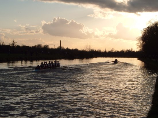
Martin P said: Any comments on the new banner? Yep, we no longer have Jon's unfeathered blade in mid-air :) | ||
| by Simon - Tue 17th Apr 2007, 1:04pm | ||
| You need to update this page. Can you get the banner so that on higher resolution displays (like the lovely new screen I have at work today) the black bit on the right extends over to right hands side of the screen. | ||
| by Martin P - Tue 17th Apr 2007, 3:03pm | ||
| You think it would look better with the black going all the way across? | ||
| by Dubya - Tue 17th Apr 2007, 3:23pm | ||
Martin P said: You think it would look better with the black going all the way across? i think the fade you've got looks pretty nice. | ||
| by Simon - Tue 17th Apr 2007, 3:38pm | ||
Martin P said: You think it would look better with the black going all the way across? Yes. The fade to black is nice, but then I see an abrupt edge between the black and the background-blue that the rest of the page has. | ||
| by Tom C - Wed 18th Apr 2007, 4:02pm | ||
| i think the JPM logo is in the way of the view into the distance, maybe it can go somewhere else? | ||
| by Jane - Wed 18th Apr 2007, 7:55pm | ||
| Perhaps just shove it and the Mitchell Cup bit further to the right, ie into the bank/black stuff? Will that still show up on low-res monitors? | ||
| by RTT - Wed 18th Apr 2007, 9:10pm | ||
| I think you've got the sidebars round the wrong way? They don't seem to match the top bar atm. | ||
| by Martin P - Thu 19th Apr 2007, 8:09am | ||
RTT said: I think you've got the sidebars round the wrong way? They don't seem to match the top bar atm. Tom, I don't see what you mean. Looks ok to me....? Which page are you looking at?Agree that the JPM logo looks in the way, I'll have a play around with it. I've essentially assumed that everyone has 1024x768 now (thus allowing it to be much wider than the old banner when 800x600 was more normal), but personally I don't tend to have my browser full screen so I didn't want to push the logos to the very far right.... | ||
| by RTT - Thu 19th Apr 2007, 8:50pm | ||
Martin P said: Tom, I don't see what you mean. Looks ok to me....? Which page are you looking at? Any page! Whenever I get the banner with the old top piece it has the new side piece, and vice versa. Thus they don't meet up properly in the top left. Maybe this is because I'm looking at the frame view and you are on fixed? | ||
| by Martin P - Fri 20th Apr 2007, 8:27am | ||
RTT said: Any page! Whenever I get the banner with the old top piece it has the new side piece, and vice versa. Thus they don't meet up properly in the top left. Maybe this is because I'm looking at the frame view and you are on fixed? Sounds incredible. (Literally!) Is anyone else seeing this?! You should never be seeing the old one. Only possible explanation I can think of is some kind of bizarre caching problem. You don't connect via a web proxy do you? (Some web proxies cache cache things too aggressively, but even so it would be wierd.) Assuming not, I reckon if you clear your cache out it should (must) sort it. | ||
| by Dubya - Fri 20th Apr 2007, 6:32pm | ||
| Clear your cache, Tom! | ||